 气泡确认框组件 (Popconfirm)
# 气泡确认框组件 (Popconfirm)
Element-UI 的 Popconfirm 组件用于点击元素时弹出气泡确认框,用于在用户执行某些操作前进行二次确认,避免误操作。
提示
Popover 组件官方文档:https://element.eleme.cn/#/zh-CN/component/popover (opens new window)
# 1. 基本用法
基本语法:使用 <el-popconfirm> 标签创建一个气泡确认框,通过 title 属性设置确认框的标题。确认和取消按钮的文本可以通过 confirm-button-text 和 cancel-button-text 属性进行设置。
<template>
  <el-popconfirm
    title="确定要删除吗?"
    confirm-button-text="确定"
    cancel-button-text="取消"
    @confirm="handleConfirm"
    @cancel="handleCancel">
    <el-button slot="reference">删除</el-button>
  </el-popconfirm>
</template>

<script>
export default {
  methods: {
    handleConfirm() {
      this.$message.success('已确认');
    },
    handleCancel() {
      this.$message.info('已取消');
    }
  }
};
</script>
1
2
3
4
5
6
7
8
9
10
11
12
13
14
15
16
17
18
19
20
21
22
23
2
3
4
5
6
7
8
9
10
11
12
13
14
15
16
17
18
19
20
21
22
23
- 标题:通过
title属性设置确认框的提示信息。 - 确认和取消按钮:通过
confirm-button-text和cancel-button-text属性自定义按钮文本。 - 事件处理:可以使用
confirm和cancel事件来处理用户点击确认或取消按钮的操作。 
# Popconfirm 属性
| 参数 | 说明 | 类型 | 可选值 | 默认值 |
|---|---|---|---|---|
| title | 标题 | String | — | — |
| confirm-button-text | 确认按钮文字 | String | — | — |
| cancel-button-text | 取消按钮文字 | String | — | — |
| confirm-button-type | 确认按钮类型 | String | — | Primary |
| cancel-button-type | 取消按钮类型 | String | — | Text |
| icon | Icon | String | — | el-icon-question |
| icon-color | Icon 颜色 | String | — | #f90 |
| hide-icon | 是否隐藏 Icon | Boolean | — | false |
# Popconfirm 方法
Popconfirm 组件本身没有定义特定的方法,但可以使用 confirm 和 cancel 事件进行操作处理。
# Popconfirm 事件
| 事件名称 | 说明 | 回调参数 |
|---|---|---|
| confirm | 点击确认按钮时触发 | — |
| cancel | 点击取消按钮时触发 | — |
# Popconfirm 插槽
| 插槽名称 | 说明 |
|---|---|
| reference | 触发 Popconfirm 显示的 HTML 元素 |
# 2. 常用示例
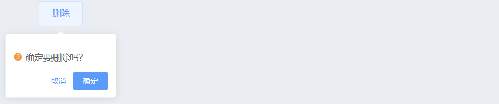
# 1. 基本使用
展示一个带有默认配置的 Popconfirm 组件,用户点击删除按钮时会弹出确认框。
<template>
  <el-popconfirm
    title="确定要删除吗?"
    @confirm="handleConfirm"
    @cancel="handleCancel">
    <el-button slot="reference" type="danger">删除</el-button>
  </el-popconfirm>
</template>

<script>
export default {
  methods: {
    handleConfirm() {
      this.$message.success('已确认删除');
    },
    handleCancel() {
      this.$message.info('已取消操作');
    }
  }
};
</script>
1
2
3
4
5
6
7
8
9
10
11
12
13
14
15
16
17
18
19
20
21
2
3
4
5
6
7
8
9
10
11
12
13
14
15
16
17
18
19
20
21
- 基本操作:点击删除按钮后,会显示带有默认配置的 Popconfirm 气泡确认框,用户可以选择确认或取消。
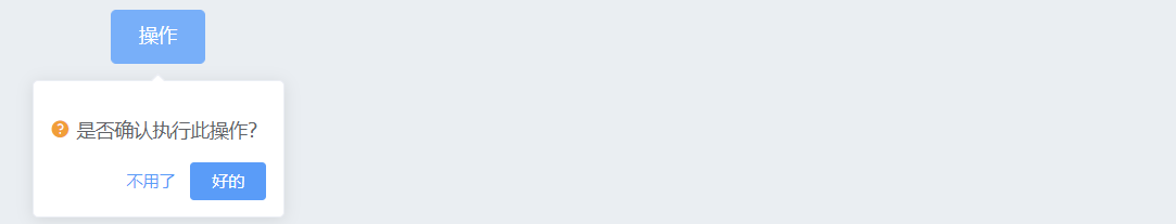
# 2. 自定义按钮文本
通过 confirm-button-text 和 cancel-button-text 自定义确认和取消按钮的文本内容。
<template>
  <el-popconfirm
    title="是否确认执行此操作?"
    confirm-button-text="好的"
    cancel-button-text="不用了"
    @confirm="handleConfirm"
    @cancel="handleCancel">
    <el-button slot="reference" type="primary">操作</el-button>
  </el-popconfirm>
</template>

<script>
export default {
  methods: {
    handleConfirm() {
      this.$message.success('操作已确认');
    },
    handleCancel() {
      this.$message.info('操作已取消');
    }
  }
};
</script>
1
2
3
4
5
6
7
8
9
10
11
12
13
14
15
16
17
18
19
20
21
22
23
2
3
4
5
6
7
8
9
10
11
12
13
14
15
16
17
18
19
20
21
22
23
- 自定义文本:自定义确认和取消按钮的文本,使其更符合实际使用场景的需求。
# 3. 自定义图标和隐藏图标
通过 icon 和 icon-color 自定义气泡确认框的图标和颜色,或者通过 hide-icon 隐藏图标。
<template>
  <el-popconfirm
    title="确认删除吗?"
    icon="el-icon-warning"
    icon-color="red"
    confirm-button-text="确定"
    cancel-button-text="取消"
    @confirm="handleConfirm"
    @cancel="handleCancel">
    <el-button slot="reference" type="danger">删除</el-button>
  </el-popconfirm>

  <el-popconfirm
    title="确定继续吗?"
    :hide-icon="true"
    confirm-button-text="继续"
    cancel-button-text="取消"
    @confirm="handleConfirm"
    @cancel="handleCancel">
    <el-button slot="reference" type="warning">继续</el-button>
  </el-popconfirm>
</template>

<script>
export default {
  methods: {
    handleConfirm() {
      this.$message.success('操作已确认');
    },
    handleCancel() {
      this.$message.info('操作已取消');
    }
  }
};
</script>
1
2
3
4
5
6
7
8
9
10
11
12
13
14
15
16
17
18
19
20
21
22
23
24
25
26
27
28
29
30
31
32
33
34
35
2
3
4
5
6
7
8
9
10
11
12
13
14
15
16
17
18
19
20
21
22
23
24
25
26
27
28
29
30
31
32
33
34
35
- 自定义图标:通过
icon和icon-color属性自定义确认框的图标和颜色,使其更具视觉提示性。 - 隐藏图标:使用
hide-icon属性可以隐藏确认框的图标,使其界面更简洁。 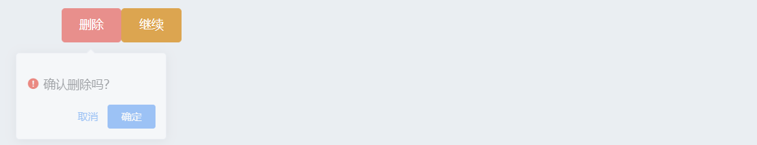
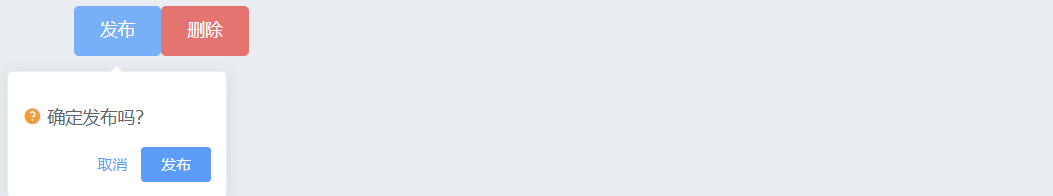
# 4. 多个 Popconfirm 组合使用
在同一页面中可以同时使用多个 Popconfirm 组件,每个组件独立控制。
<template>
  <div>
    <el-popconfirm
      title="确定发布吗?"
      confirm-button-text="发布"
      cancel-button-text="取消"
      @confirm="handleConfirm"
      @cancel="handleCancel">
      <el-button slot="reference" type="primary">发布</el-button>
    </el-popconfirm>

    <el-popconfirm
      title="确定删除吗?"
      confirm-button-text="删除"
      cancel-button-text="取消"
      @confirm="handleConfirm"
      @cancel="handleCancel">
      <el-button slot="reference" type="danger">删除</el-button>
    </el-popconfirm>
  </div>
</template>

<script>
export default {
  methods: {
    handleConfirm() {
      this.$message.success('操作已确认');
    },
    handleCancel() {
      this.$message.info('操作已取消');
    }
  }
};
</script>
1
2
3
4
5
6
7
8
9
10
11
12
13
14
15
16
17
18
19
20
21
22
23
24
25
26
27
28
29
30
31
32
33
34
2
3
4
5
6
7
8
9
10
11
12
13
14
15
16
17
18
19
20
21
22
23
24
25
26
27
28
29
30
31
32
33
34
- 组合使用:多个 Popconfirm 组件可以在同一页面中组合使用,每个组件都有自己独立的确认和取消处理逻辑。
总结
- 简洁的用户确认界面:Popconfirm 提供了一个简洁的确认界面,可以有效防止用户误操作。
- 灵活的自定义选项:通过多种属性配置,可以定制按钮文本、图标样式等,使确认框更符合场景需求。
- 方便的事件处理:支持
confirm和cancel事件,允许开发者在用户确认或取消操作时进行处理。
编辑此页 (opens new window)