 栅格布局 (Layout)
# 栅格布局 (Layout)
Element-UI 提供的Layout 布局系统基于 24 分栏的栅格设计,能够通过简单的组合和配置来快速创建响应式页面布局。布局系统的核心组件是 <el-row> 和 <el-col>。
提示
Layout 布局官方文档:https://element.eleme.cn/#/zh-CN/component/layout (opens new window)
# 1. 基本概念
- 栅格系统:页面被划分为 24 等分的栅格系统。每个
<el-col>组件通过span属性定义其占据的列数。 - 响应式设计:通过在不同屏幕尺寸下设置栅格属性,布局能够响应视口变化。
# <el-row> 组件
<el-row> 用于创建行容器,可以在其中放置一个或多个 <el-col> 组件。它支持设置栅格间距和 flex 布局模式。
# Row 可选参数
| 参数 | 说明 | 类型 | 可选值 | 默认值 |
|---|---|---|---|---|
| gutter | 栅格间隔,定义列之间的间距 | number | — | 0 |
| type | 布局模式,支持 flex,现代浏览器下有效 | string | — | — |
| justify | Flex 布局下的水平排列方式 | string | start / end / center / space-around / space-between | start |
| align | Flex 布局下的垂直排列方式 | string | top / middle / bottom | — |
| tag | 自定义元素标签 | string | * | div |
# 参数使用示例
<template>
  <el-row :gutter="20" type="flex" justify="space-between" align="middle">
    <el-col :span="8">
      <div class="grid-content bg-purple"></div>
    </el-col>
    <el-col :span="8">
      <div class="grid-content bg-purple"></div>
    </el-col>
    <el-col :span="8">
      <div class="grid-content bg-purple"></div>
    </el-col>
  </el-row>
</template>
1
2
3
4
5
6
7
8
9
10
11
12
13
2
3
4
5
6
7
8
9
10
11
12
13
:gutter="20":使用冒号表示动态绑定,20是动态值。表示列之间的间距为 20 像素。type="flex":启用 flex 布局,使<el-row>支持 flexbox 的排列方式。justify="space-between":设置水平排列方式,使子元素均匀分布,首尾元素贴边。align="middle":设置垂直排列方式,使子元素在行容器中居中对齐。
# <el-col> 组件
y 用于定义栅格列,必须作为 <el-row> 的子组件使用。它支持响应式设置,能够适应不同的屏幕尺寸。
# Col 可选参数
| 参数 | 说明 | 类型 | 可选值 | 默认值 |
|---|---|---|---|---|
| span | 栅格占据的列数 | number | — | 24 |
| offset | 栅格左侧的间隔格数 | number | — | 0 |
| push | 栅格向右移动的格数 | number | — | 0 |
| pull | 栅格向左移动的格数 | number | — | 0 |
| xs | <768px 响应式栅格数或者栅格属性对象 | number/object | — | — |
| sm | ≥768px 响应式栅格数或者栅格属性对象 | number/object | — | — |
| md | ≥992px 响应式栅格数或者栅格属性对象 | number/object | — | — |
| lg | ≥1200px 响应式栅格数或者栅格属性对象 | number/object | — | — |
| xl | ≥1920px 响应式栅格数或者栅格属性对象 | number/object | — | — |
# 参数使用示例
<template>
  <el-row :gutter="20">
    <el-col :span="6" :xs="{span: 12, offset: 1}" :sm="8" :md="6" :lg="4" :xl="2">
      <div class="grid-content bg-purple"></div>
    </el-col>
    <el-col :span="6">
      <div class="grid-content bg-purple"></div>
    </el-col>
    <el-col :span="6">
      <div class="grid-content bg-purple"></div>
    </el-col>
    <el-col :span="6">
      <div class="grid-content bg-purple"></div>
    </el-col>
  </el-row>
</template>
1
2
3
4
5
6
7
8
9
10
11
12
13
14
15
16
2
3
4
5
6
7
8
9
10
11
12
13
14
15
16
:span="6":使用动态绑定设置当前列占据 6 列。:xs="{span: 12, offset: 1}":在屏幕宽度小于 768px 时,占据 12 列,并向右偏移 1 列。:sm="8":在屏幕宽度大于等于 768px 时,占据 8 列。:md="6"、:lg="4"、:xl="2":在中、大、超大屏幕尺寸下分别占据相应的列数。
# 2. 快速布局步骤
# 1. 定义布局结构
- 使用
<el-row>和<el-col>组件来构建页面布局。 <el-row>用于创建行容器,内部放置一个或多个<el-col>组件。<el-col>用于定义列,每行最多可以放置 24 列。
# 2. 设置栅格占比
- 在
<el-col>组件中使用:span属性定义每个栅格占据的列数。整个栅格系统以 24 列为基础。
<el-row>
  <el-col :span="8">
    <div class="grid-content">区域 1</div>
  </el-col>
  <el-col :span="8">
    <div class="grid-content">区域 2</div>
  </el-col>
  <el-col :span="8">
    <div class="grid-content">区域 3</div>
  </el-col>
</el-row>
1
2
3
4
5
6
7
8
9
10
11
2
3
4
5
6
7
8
9
10
11
:span="8":设置当前栅格占据 8 列,使得一行总共放置 3 个等宽栅格。
# 3. 添加栅格间距
- 在
<el-row>上使用:gutter属性来设置列之间的间距。
<el-row :gutter="20">
  <el-col :span="8">
    <div class="grid-content">区域 1</div>
  </el-col>
  <el-col :span="8">
    <div class="grid-content">区域 2</div>
  </el-col>
  <el-col :span="8">
    <div class="grid-content">区域 3</div>
  </el-col>
</el-row>
1
2
3
4
5
6
7
8
9
10
11
2
3
4
5
6
7
8
9
10
11
:gutter="20":设置列之间的间距为 20 像素。- 注意:
gutter是通过为每个栅格的左右内边距设置一半的间距实现的,因此不会影响<el-col>的span占比。

# 4. 启用 Flex 布局
- 在
<el-row>上设置type="flex"来启用 Flexbox 布局,使得可以使用justify和align属性进行更灵活的排列。
<el-row type="flex" justify="space-between" align="middle">
  <el-col :span="8">
    <div class="grid-content">区域 1</div>
  </el-col>
  <el-col :span="8">
    <div class="grid-content">区域 2</div>
  </el-col>
  <el-col :span="8">
    <div class="grid-content">区域 3</div>
  </el-col>
</el-row>
1
2
3
4
5
6
7
8
9
10
11
2
3
4
5
6
7
8
9
10
11
type="flex":启用 Flexbox 布局,允许在<el-row>内部使用 Flexbox 排列方式。justify="space-between":设置水平排列方式,使子元素均匀分布,首尾元素贴边。align="middle":设置垂直排列方式,使子元素在行容器中居中对齐。
# 5. 响应式布局设置
- 使用
<el-col>的xs、sm、md、lg、xl属性实现响应式设计,根据不同屏幕尺寸设置不同的栅格属性。
<el-row :gutter="20">
  <el-col :span="8" :xs="24" :sm="12" :md="8" :lg="6">
    <div class="grid-content">响应式块</div>
  </el-col>
  <el-col :span="8" :xs="24" :sm="12" :md="8" :lg="6">
    <div class="grid-content">响应式块</div>
  </el-col>
  <el-col :span="8" :xs="24" :sm="12" :md="8" :lg="6">
    <div class="grid-content">响应式块</div>
  </el-col>
</el-row>
1
2
3
4
5
6
7
8
9
10
11
2
3
4
5
6
7
8
9
10
11
:xs="24":在屏幕宽度小于 768px 时,栅格占满整行。:sm="12":在屏幕宽度大于等于 768px 时,栅格占据 12 列(半行)。:md="8":在屏幕宽度大于等于 992px 时,栅格占据 8 列(1/3 行)。:lg="6":在屏幕宽度大于等于 1200px 时,栅格占据 6 列(1/4 行)。
# 3. 基于断点的隐藏类
Element-UI 提供了一系列基于断点的隐藏类,允许在特定视口尺寸下隐藏元素。要使用这些类,需要引入 display.css:
import 'element-ui/lib/theme-chalk/display.css';
1
# 隐藏类列表
| 类名 | 说明 |
|---|---|
hidden-xs-only | 当视口在 xs 尺寸时隐藏 |
hidden-sm-only | 当视口在 sm 尺寸时隐藏 |
hidden-sm-and-down | 当视口在 sm 及以下尺寸时隐藏 |
hidden-sm-and-up | 当视口在 sm 及以上尺寸时隐藏 |
hidden-md-only | 当视口在 md 尺寸时隐藏 |
hidden-md-and-down | 当视口在 md 及以下尺寸时隐藏 |
hidden-md-and-up | 当视口在 md 及以上尺寸时隐藏 |
hidden-lg-only | 当视口在 lg 尺寸时隐藏 |
hidden-lg-and-down | 当视口在 lg 及以下尺寸时隐藏 |
hidden-lg-and-up | 当视口在 lg 及以上尺寸时隐藏 |
hidden-xl-only | 当视口在 xl 尺寸时隐藏 |
# 使用示例
<template>
  <div>
    <div class="hidden-xs-only">在 xs 尺寸时隐藏</div>
    <div class="hidden-sm-only">在 sm 尺寸时隐藏</div>
    <div class="hidden-md-and-down">在 md 及以下尺寸时隐藏</div>
    <div class="hidden-lg-and-up">在 lg 及以上尺寸时隐藏</div>
  </div>
</template>

<script>
import 'element-ui/lib/theme-chalk/display.css';

export default {
  name: "HiddenClassExample"
};
</script>
1
2
3
4
5
6
7
8
9
10
11
12
13
14
15
16
2
3
4
5
6
7
8
9
10
11
12
13
14
15
16
# 4. 常用布局示例
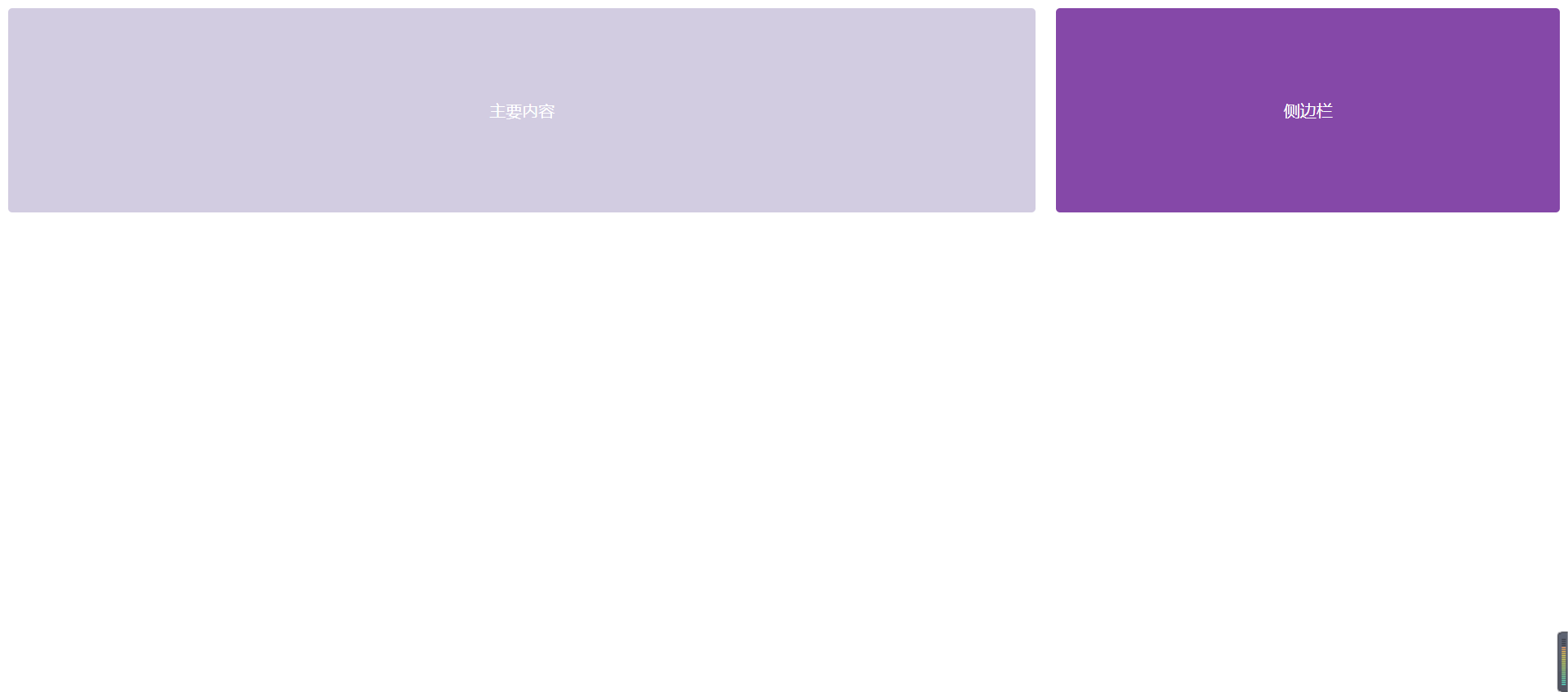
# 简单的两栏布局
这种布局适合简单的内容展示,通常用于博客或文章页面,其中一栏用于主要内容,另一栏用于侧边栏。
<template>
  <el-row :gutter="20">
    <!-- 主内容区域 -->
    <el-col :span="16">
      <div class="grid-content bg-purple-light">主要内容</div>
    </el-col>
    <!-- 侧边栏 -->
    <el-col :span="8">
      <div class="grid-content bg-purple">侧边栏</div>
    </el-col>
  </el-row>
</template>

<style scoped>
.grid-content {
  height: 200px;
  border-radius: 4px;
  text-align: center;
  line-height: 200px;
  color: white;
}
.bg-purple {
  background-color: #8e44ad;
}
.bg-purple-light {
  background-color: #d3cce3;
}
</style>
1
2
3
4
5
6
7
8
9
10
11
12
13
14
15
16
17
18
19
20
21
22
23
24
25
26
27
28
2
3
4
5
6
7
8
9
10
11
12
13
14
15
16
17
18
19
20
21
22
23
24
25
26
27
28
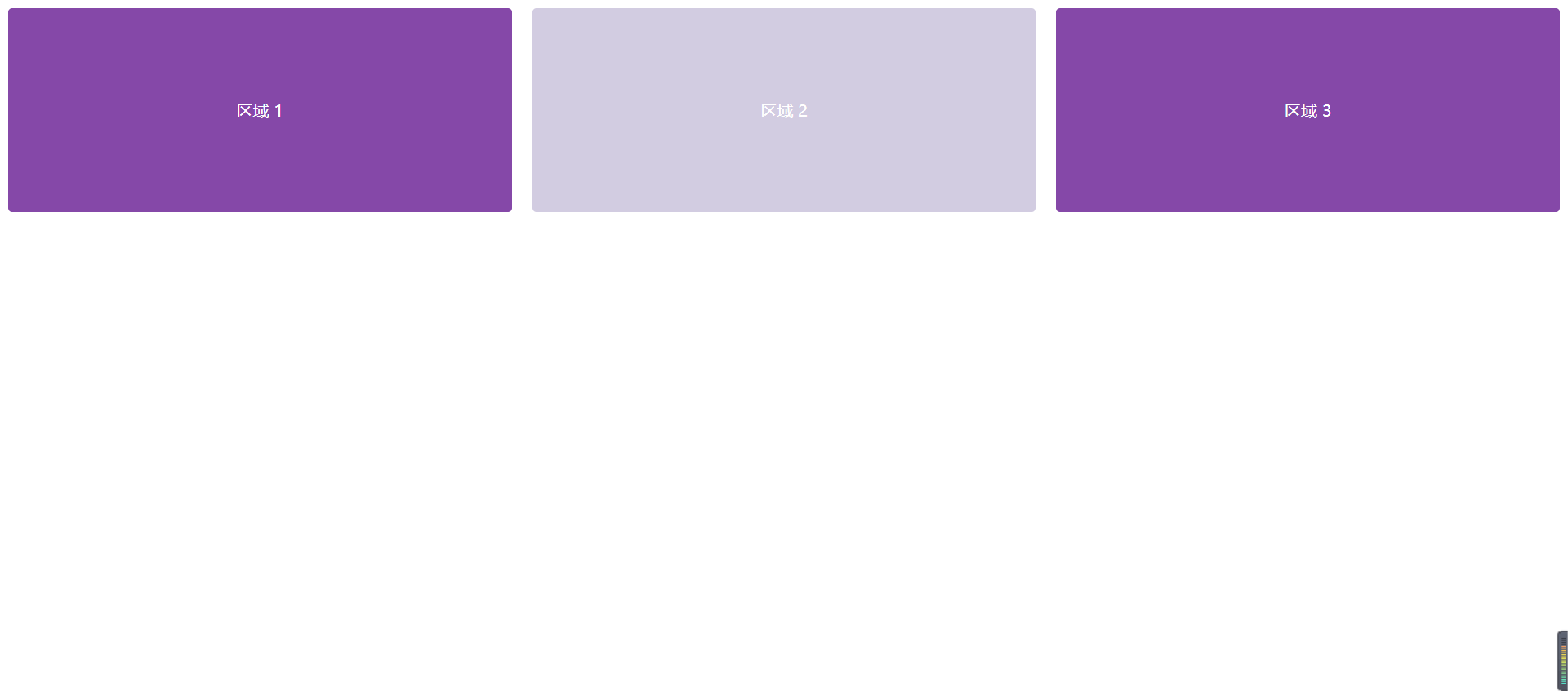
# 三栏均分布局
这种布局用于需要三个等宽内容区域的场景,适合展示不同的模块信息。
<template>
  <el-row :gutter="20">
    <el-col :span="8">
      <div class="grid-content bg-purple">区域 1</div>
    </el-col>
    <el-col :span="8">
      <div class="grid-content bg-purple-light">区域 2</div>
    </el-col>
    <el-col :span="8">
      <div class="grid-content bg-purple">区域 3</div>
    </el-col>
  </el-row>
</template>

<style scoped>
.grid-content {
  height: 200px;
  border-radius: 4px;
  text-align: center;
  line-height: 200px;
  color: white;
}

.bg-purple {
  background-color: #8e44ad;
}

.bg-purple-light {
  background-color: #d3cce3;
}
</style>
1
2
3
4
5
6
7
8
9
10
11
12
13
14
15
16
17
18
19
20
21
22
23
24
25
26
27
28
29
30
31
2
3
4
5
6
7
8
9
10
11
12
13
14
15
16
17
18
19
20
21
22
23
24
25
26
27
28
29
30
31
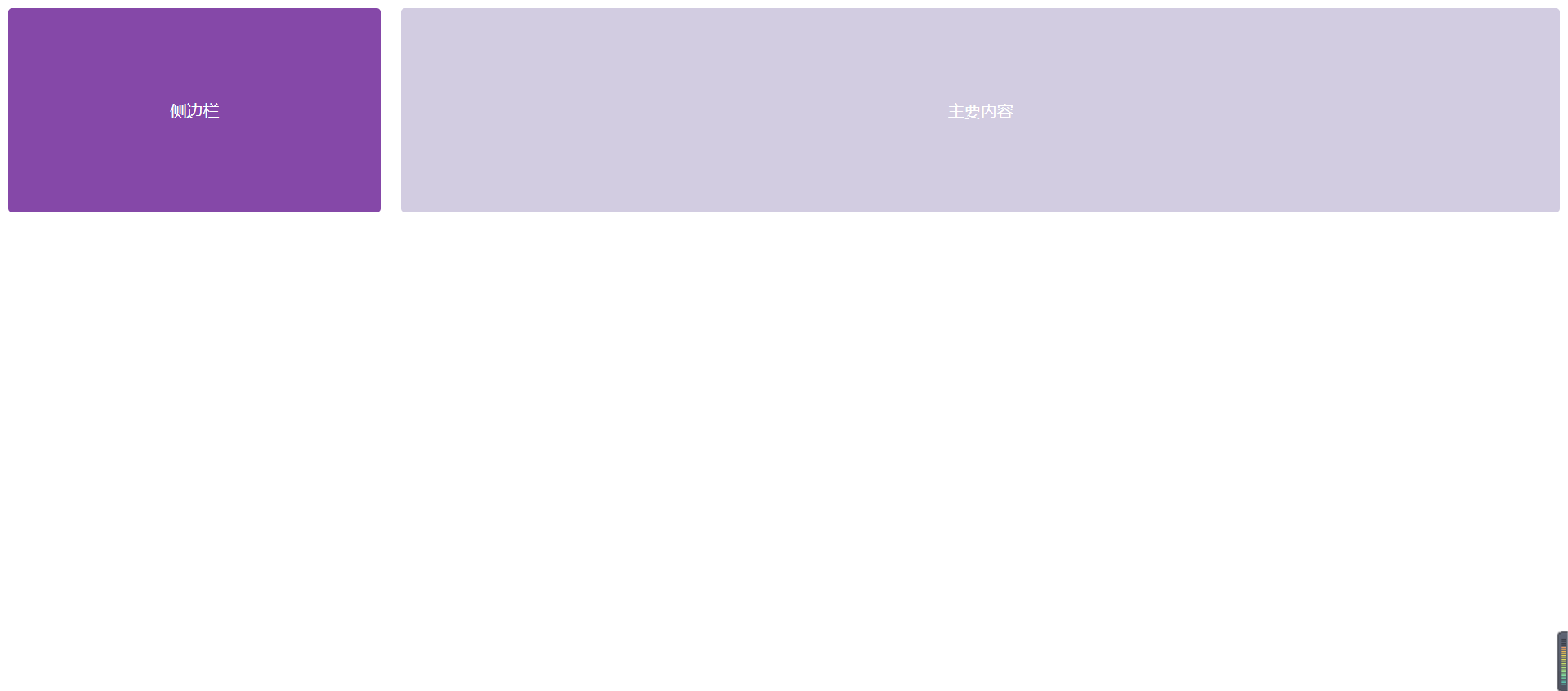
# 侧边栏布局
这种布局通常用于后台管理系统或仪表盘,左侧为导航栏,右侧为内容展示区域。
<template>
  <el-row :gutter="20">
    <!-- 侧边栏 -->
    <el-col :span="6">
      <div class="grid-content bg-purple">侧边栏</div>
    </el-col>
    <!-- 主要内容区域 -->
    <el-col :span="18">
      <div class="grid-content bg-purple-light">主要内容</div>
    </el-col>
  </el-row>
</template>

<style scoped>
.grid-content {
  height: 200px;
  border-radius: 4px;
  text-align: center;
  line-height: 200px;
  color: white;
}

.bg-purple {
  background-color: #8e44ad;
}

.bg-purple-light {
  background-color: #d3cce3;
}
</style>
1
2
3
4
5
6
7
8
9
10
11
12
13
14
15
16
17
18
19
20
21
22
23
24
25
26
27
28
29
30
2
3
4
5
6
7
8
9
10
11
12
13
14
15
16
17
18
19
20
21
22
23
24
25
26
27
28
29
30
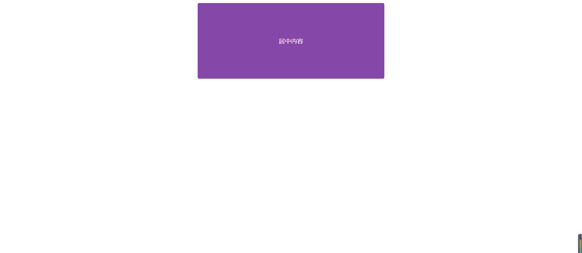
# 带偏移的内容布局
这种布局适合在某些情况下需要内容居中或留出特定边距的场景。
<template>
  <el-row :gutter="20">
    <el-col :span="8" :offset="8">
      <div class="grid-content bg-purple">居中内容</div>
    </el-col>
  </el-row>
</template>

<style scoped>
.grid-content {
  height: 200px;
  border-radius: 4px;
  text-align: center;
  line-height: 200px;
  color: white;
}

.bg-purple {
  background-color: #8e44ad;
}

.bg-purple-light {
  background-color: #d3cce3;
}
</style>
1
2
3
4
5
6
7
8
9
10
11
12
13
14
15
16
17
18
19
20
21
22
23
24
25
2
3
4
5
6
7
8
9
10
11
12
13
14
15
16
17
18
19
20
21
22
23
24
25
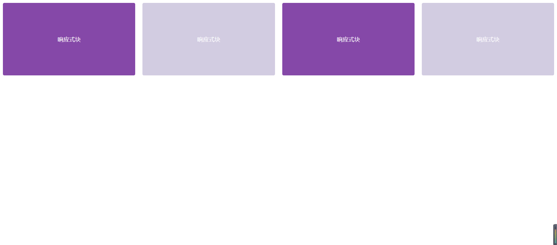
# 响应式布局
在不同的屏幕尺寸下,栅格宽度可以变化,实现响应式设计。
<template>
  <el-row :gutter="20">
    <el-col :span="6" :xs="24" :sm="12" :md="8" :lg="6">
      <div class="grid-content bg-purple">响应式块</div>
    </el-col>
    <el-col :span="6" :xs="24" :sm="12" :md="8" :lg="6">
      <div class="grid-content bg-purple-light">响应式块</div>
    </el-col>
    <el-col :span="6" :xs="24" :sm="12" :md="8" :lg="6">
      <div class="grid-content bg-purple">响应式块</div>
    </el-col>
    <el-col :span="6" :xs="24" :sm="12" :md="8" :lg="6">
      <div class="grid-content bg-purple-light">响应式块</div>
    </el-col>
  </el-row>
</template>

<style scoped>
.grid-content {
  height: 200px;
  border-radius: 4px;
  text-align: center;
  line-height: 200px;
  color: white;
}

.bg-purple {
  background-color: #8e44ad;
}

.bg-purple-light {
  background-color: #d3cce3;
}
</style>
1
2
3
4
5
6
7
8
9
10
11
12
13
14
15
16
17
18
19
20
21
22
23
24
25
26
27
28
29
30
31
32
33
34
2
3
4
5
6
7
8
9
10
11
12
13
14
15
16
17
18
19
20
21
22
23
24
25
26
27
28
29
30
31
32
33
34
# 布局说明
- 两栏布局:一个大块主内容区域和一个小块侧边栏。
- 三栏均分布局:每个区域均分页面宽度,适合模块化信息展示。
- 侧边栏布局:典型的后台管理系统布局,左侧固定宽度用于导航。
- 带偏移布局:用于内容居中或留出边距的场景,通过
offset设置偏移量。 - 响应式布局:通过
xs、sm、md、lg等属性实现不同尺寸设备下的响应式布局。
编辑此页 (opens new window)