 结果组件 (Result)
# 结果组件 (Result)
Element UI 的 Result 组件用于对用户的操作结果或者异常状态进行反馈。它可以在用户操作后,通过一个简洁明了的方式告知用户操作的结果,如成功、警告、信息或错误等。
提示
Result 组件官方文档:https://element.eleme.cn/#/zh-CN/component/result (opens new window)
# 1. 基本用法
基本语法:使用 <el-result> 标签创建一个结果反馈区域,通过 icon 属性设置结果的图标类型,并通过 title 和 sub-title 属性设置主标题和副标题。
<template>
  <el-result icon="success" title="成功提示" sub-title="操作已成功完成">
    <template #extra>
      <el-button type="primary">返回</el-button>
      <el-button>继续操作</el-button>
    </template>
  </el-result>
</template>

<script>
export default {
  // 组件逻辑可以在这里编写
};
</script>
2
3
4
5
6
7
8
9
10
11
12
13
14
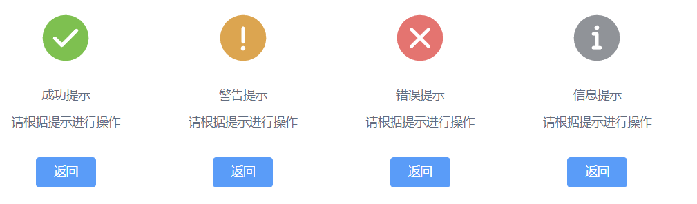
icon属性:设置结果反馈的图标类型。可选值为success、warning、info、error,默认值为info。title属性:设置结果的主标题,用于明确告知用户结果状态。sub-title属性:设置结果的副标题,用于补充说明主标题的内容。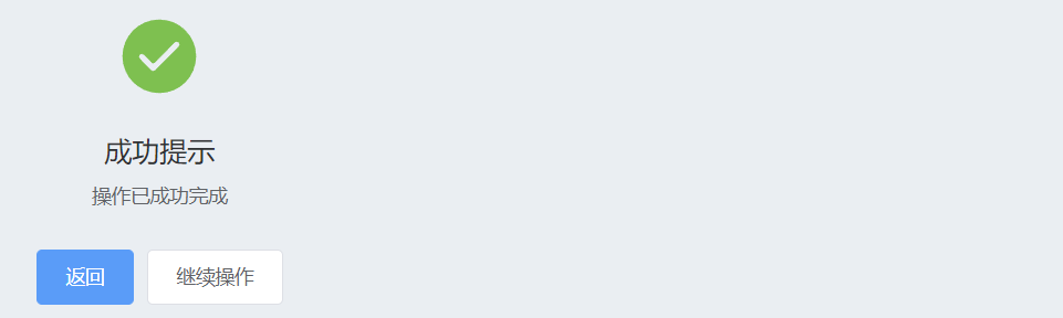
# 2. Result 属性
| 参数 | 说明 | 类型 | 可选值 | 默认值 |
|---|---|---|---|---|
| title | 主标题文本 | string | — | — |
| sub-title | 二级标题文本 | string | — | — |
| icon | 图标类型 | string | success / warning / info / error | info |
title:主标题文本,用于显示结果的主要信息或状态。sub-title:二级标题文本,通常用于补充主标题的信息。icon:结果图标类型,用于表示结果的状态,例如成功、警告、信息或错误。
# 3. Result 插槽
Result 组件提供了多个插槽,用于自定义图标、标题、副标题以及底部额外区域的内容:
| 插槽名 | 说明 |
|---|---|
| icon | 自定义图标 |
| title | 自定义标题 |
| subTitle | 自定义二级标题 |
| extra | 自定义底部额外区域 |
# 4. 插槽使用示例
通过插槽,可以轻松定制 Result 组件的外观和内容,使其更符合特定的需求和风格。
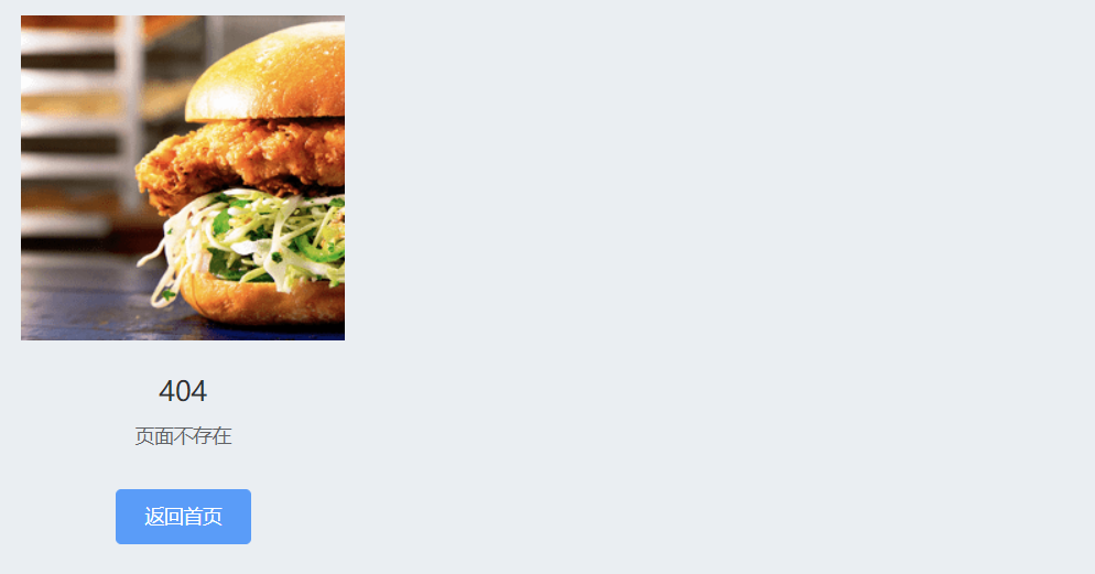
# 自定义图标示例
你可以使用 icon 插槽来替换默认的图标,并使用自定义的 SVG 图标或图片。
<template>
  <el-result title="404" sub-title="页面不存在">
    <template #icon>
      <!-- <img src="path/to/custom-icon.svg" alt="404图标"> -->
      <img src="https://shadow.elemecdn.com/app/element/hamburger.9cf7b091-55e9-11e9-a976-7f4d0b07eef6.png" alt="404图标">
    </template>
    <template #extra>
      <el-button type="primary">返回首页</el-button>
    </template>
  </el-result>
</template>

<script>
export default {
  // 组件逻辑可以在这里编写
};
</script>
2
3
4
5
6
7
8
9
10
11
12
13
14
15
16
17
# 自定义标题和副标题示例
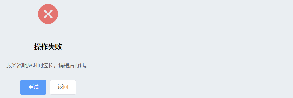
通过 title 和 subTitle 插槽,可以将标题和副标题替换为自定义内容。
<template>
  <el-result icon="error">
    <template #title>
      <h1>操作失败</h1>
    </template>
    <template #subTitle>
      <p>服务器响应时间过长,请稍后再试。</p>
    </template>
    <template #extra>
      <el-button type="primary">重试</el-button>
      <el-button>返回</el-button>
    </template>
  </el-result>
</template>
2
3
4
5
6
7
8
9
10
11
12
13
14
# 5. 常用示例
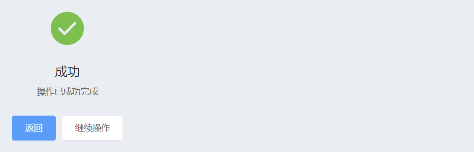
# 1. 成功提示
当用户操作成功时,可以使用 success 图标类型,并通过 title 和 sub-title 属性来告知用户操作结果。
<el-result icon="success" title="成功" sub-title="操作已成功完成">
  <template #extra>
    <el-button type="primary">返回</el-button>
    <el-button>继续操作</el-button>
  </template>
</el-result>
2
3
4
5
6
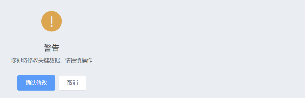
# 2. 警告提示
当用户操作可能带来一些风险时,可以使用 warning 图标类型,并通过 title 和 sub-title 提醒用户注意事项。
<el-result icon="warning" title="警告" sub-title="您即将修改关键数据,请谨慎操作">
  <template #extra>
    <el-button type="primary">确认修改</el-button>
    <el-button>取消</el-button>
  </template>
</el-result>
2
3
4
5
6
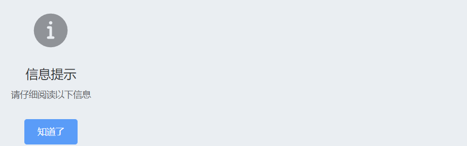
# 3. 信息提示
在需要告知用户一些中性的信息时,可以使用 info 图标类型,并通过 title 和 sub-title 提供详细信息。
<el-result icon="info" title="信息提示" sub-title="请仔细阅读以下信息">
  <template #extra>
    <el-button type="primary">知道了</el-button>
  </template>
</el-result>
2
3
4
5
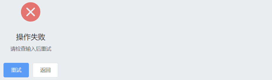
# 4. 错误提示
当用户操作失败时,可以使用 error 图标类型,并通过 title 和 sub-title 告知用户错误详情。
<el-result icon="error" title="操作失败" sub-title="请检查输入后重试">
  <template #extra>
    <el-button type="primary">重试</el-button>
    <el-button>返回</el-button>
  </template>
</el-result>
2
3
4
5
6
总结
Result 组件是一个非常直观且易于使用的工具,用于在用户操作后显示结果状态。它提供了丰富的自定义选项和插槽,可以根据需求灵活调整显示内容和样式。通过 Result 组件,开发者可以为用户提供明确的反馈,帮助他们了解操作结果并进行后续操作。